General Notes
Displaying Data
Bins: Often, its hard to differentiate numerative data so a solution is to arbitrarily decide ranges, typically equal. These ranges are bins and can be used to display. For instance, age groups would be bins (ie 18-25,25-35). The general rule with bins is to put data in the highest of the bins, so if a person is exactly 25 they will go into the 25-35 bin.
Area Principle: On graphs we tend to be influnced by the area displayed, rather than looking at how it aligns to the numbers. As such, if you want to tell the truth make sure the areas of the display elements are proportionate. If you want to deceive, make sure they are not.
Relative frequency: Any display in which the frequency is displayed as a percentage of the total, rather than simply a count.
Displaying Quantitative Data:
Graphical:
- Stemplot
- Histogram
- Boxplot
Verbal:
- Shape – peaks, symmetry, skewness, outliers
- Centre – median and mean
- Spread – range, standard deviation and interquartile range (IQR)
Numerical:
- Center: mean and median
- Spread: standard deviation and IQR
- Distributions: five-number summary
Displaying Two Variable Data
| Displays for Two Variables | ||
| Variable One | Variable Two | |
| Categorical | Quantative | |
| Categorical | Two-way Table | Boxplot |
| Quantative | Boxplot | Scatter Plot |
For two Quantitative Variables: use Scatter Plot.
For two Categorical Variables: use Two-way Table.
For one Categorical Variable and one Quantative Variable use a Box Plot.
Frequency Table:
Gender CountMale 450Female 550
Relative Frequency Table:
Gender %Male 45Female 55
The problem with frequency tables is when there are a lot of categories.
Bar Chart:
Data needs to be in the same category.
Pie Chart:
Data needs to be in the same category.
Contingency Table:
Histiogram:
Good for displaying a single quantitative variable.
A histiogram will have some type of bins along the x-axis.
Stem and Leaf Display:
Good for displaying a single quantitative variable.
Alternative names include stemplots.
4 | 0 3 73 | 2 | 11 | 0 0 2 1 4
How this works is that the top set of values are 40, 43, 47, there are no values in the 30 range, then there is a 21 and a whole lot of values in the 10 range. In esssence, this is a count of the various bins. The 1,2,3,4 are the stems and the values after them are the leaves.
It is a lot like a sideways histiogram, but it looks less neat and yet gives more information about the frequency of specific numbers that make up each of the bins.
Box Plot: (Is this just a dot plot????)
Good for displaying a single quantitative variable.
Dot Plot:
4 | *3 | ****2 | 1 | **
The same as the leaf display but instead of digits it uses dots for each instance in a bin.
Shape
Unimodal – one peakBimodal – two peaksMultimodal – three or more peaks
Uniform – Doesnt particularly have a peak.
Symmetric: if you fold at the middle do the two halves match?
If it is not symmetric the end that is smaller and stretched is called a tail and the data is considered skewed.
Outliers can make displaying data difficult, but they can also be important to add for the sake of insight.
Gaps are also important, might indicate different data sources.
Numerical Summaries
| Rough Best Practices | ||
| Measurement Type | Distribution Type | |
| Symmetric | Skewed | |
| Centre | Mean | Median |
| Spread | Standard Deviation | Interquartile Range (IQR) |
Center
The middle value that divides the histogram into two equal areas is called the median. (Reword this as its copied).
The mean and the median are used to describe the center.
The mean is more often used.
The mean is affected by skew and outliers.
The median is not affected by skew and outliers.
Spread
Range = maximum value – minumum value
One quarter of the data lies below the lower quartile, and one quarter of the data lies above the upper quartile, so half the data lies between them. The quartiles border the middle half of the data ??? Not my words!!!???
interquartile range (IQR) = upper quartile – lower quartile
Lower quartile 25th percentile, upper quartile 75th percentile
(!!! Put more effort into understanding percentiles !!!)
First quartile: median of the first half of ordered data
Second Quartile: just typical median.
Third Quartile: median of the second half of the ordered data
5-number summary:
Max | 10Q3 | 7.5Median | 5.0Q1 | 2.5Min | 1.0
Page 86 of pdf
Scatter Plot
Values of explanatory variable appear on x-axis.
Values of response variable appear on y-axis.
Pattern Forms:
- Linear
- Curved
- ????
Direction:
- Positively associated if y increases as x increases.
- Negatively associates if y decreases as x increases.
- Only relevant when linear.
Scatter:
- Strong relationship, less scatter.
- Weak relationship, more scatter.
Correlation:
Correlation is the measure of the direction and strength of a linear relationship between two quantitative variables.
r – Correlation Coefficient
r is between -1 and 1
r = 0 = no linear relationship
r = +1 = perfect, linear positive relationship
r = -1 = perfect, linear negative relationship
While there is no clear agreement on what constitutes a strong or weak correlation, the following rough rules apply (RR the truthful art):
0.1–0.3 is modest.
0.3–0.5 is moderate.
0.5–0.8 is strong.
0.8–0.9 is very strong.
Spearman’s resistant correlation coefficient and Kendall rank correlation coefficient. are ways to deal with outliers affecting correlation coefficients.
Locally Weighted Scatter Plot Smoothing(LOWESS):
Statistical Concepts
Standard Deviation
Roughly: Average distance from mean.
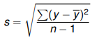
The advantage of the standard deviation is that, unlike range, it will not be so badly affected by outliers. It is squared to make sure y – y-bar is positive and the square root is added to counteract the squaring.
s = standard deviation (sometimes uses lower case sigma)
Σ = sum (called sigma, upper case)
y = data point
y-bar = average of data point
n = number of samples (-1 is added if only data for a sample of the population is provided)
Qualities:
- Will be a positive value unless its 0, then it will be 0.
- Basically measures spread.
- Used mostly with symmetric data.
68-95-99.7 Rule:
For any Gaussian (normal) model, the following rule true:
68% of observations within 1 std deviations of the mean (called σ1)
95% of observations within 2 std deviations of the mean (called σ2)
99.7% of observations within 3 std deviations of the mean (called σ3)
Scientific results in particle physics, like the Large Hadron Collider, use sigma 5 (σ5).
Gaussian Distribution
Sometimes called Gaussian model or normal model.
Variables basically never have a precise Gaussian distribution, but none the less it is a good way to look at data.
µ – pronounced ‘mu’ – mean of a theoretical Gaussian Distribution.
σ – pronounced ‘sigma’ – Standard Deviation of a theoretical Gaussian Distribution
Linear Regression
Linear regression basically allows you to make predictions about the average trend of the data assuming the data meets certain condition. This type of model is called a linear model and is essentially a straight line through the data, but requires specific conditions.
Conditions for Regression
Quantitative Data Condition: The data the regression is being performed on must be numeric data.
Straight Enough Condition: The data needs to be vaguely linear or straight, use a scatter plot to give a quick look.
Outlier Condition: As an outlier can throw off the line of regression best practice is to run regression analysis twice, once with the outlier in the data set and once without.
Independence of Errors: Sometimes a data set will have a pattern that suggests some type of causality which will not be captured by a regression line. For example, before 1 on the x axis values might be below the regression line whereas after 1 they might be above it and then after two below and after three above. This wavy pattern suggests a trend that will not be captured by linear regression.
Homoscedasticity: The scatter of the graph may grow as the data set continues, regression will not capture this trend of growing scatter in the data if it happens to be uniform.
Normality of Error Distribution: There may be a strange scattering of the data, for instance in waves away from the regression line, suggesting a trend that does not show on the linear regression line.
Formula
Regression Line General Formula
Y = Intercept + X × Slope
![]()
y-hat – predicted value, the ‘hat’ character over it is to show its predicted.
b0 – intercept – the value of y when x is 0, so the point at which the function intercepts of the y-axis.
b1 – slope – rise over run
x – ????
??? Look at how to do this in SPSS ???
This follows the general algebra formula for a line, y = mx + c
Residual Formula
![]()
e – Residual – How much the prediction misses the actual observation by.
y – Observation – Actual functional observation.
y-hat – Prediction – the prediction, typically provided by regression analysis.
R-squared – Explains the % of variation that is explained by the variable. For instance, it might be that 0.63 or 63% of the health outcome for a patient is described by their BMI.
Because linear regression lines are straight they can make bad predictions in certain cases where something is subject to dramatic and expotential change. For instance, if you were to graph the heights of males at 5 years old and then again at 12 years old you would not predict they would stop growing at 25-30 years of age and so the regression line would show continued growth.
Also, sometimes association between the growth of one variable and another might be due to a hidden variable (sometimes called lurking variable), rather than variable one causing the growth in variable two.
Squaring residuals: If we are trying to understand how much difference there is in general between the regression line and the actual data we square the residuals so that they can be added up, as otherwise there would be positives and negatives that would cancel each other.
Line of best fit: The line in which the sum of the residuals is smallest.
Least Squares Line Formula
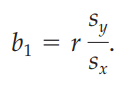
b1 –
r –
sy –
sx –
Studies, Samples and Experiments
Observational Studies: Observe cases, not interference from observer. Polls, surveys, etc. No condition/s of the experiment are imposed.
Experimental Studies: Designed to establish cause and effect. Some condition/s of the experiment is imposed, for instance whether or not someone takes an experimental drug is imposed upon the population.
Factors: The key aspects of the experiment, for example an experiment designed to test radiation expose would have radiation exposure as its factor.
Levels: The number of variations of a factor, for example an experiment to test radiation may have two levels: one group exposed to radiation and the other not. It could have four levels: 1 group exposed to no radiation, 1 to low, 1 to medium, 1 to high.
Four Principles of Experiment Design
Control: Mechanisms to try to get similar results. Blind and double-blind studies, removing as much confusing information, placebos, etc.
Randomize: Objects of study need to be as randomly assigned as possible, after taking into account conditions required for experiment, with the intention of lowering the effects of sunken variables, etc. For example: we may be studying people who have arthritis. We cannot randomize that aspect, but after collecting 1000 people with arthritis we can randomly assign them into the levels of the experiment, such as 500 randomly assigned to receive treatment and 500 randomly assigned to receive placebo.
Replicate: The study must be able to be replicated with different objects participants of the same kind, by kind it is meant that participants with the same condition.
Block: Placing participants in groups to test things in greater detail. For instance, a drug might have different effects on males and females so two blocks might be male and female.
Sampling
Census: Attempts to take a sample of the entire population
Population: All objects or subjects of interest in a study.
Sample: Part of the population that intended to represent the whole.
Random Sample Types
- Simple random sample (SRS) – 100 person population, 10 chosen at random equal chance. Subject to sampling error, for example the 10 chosen might all be men.
- Stratified sample
- Cluster sample
- Systematic sample
- Multistage sample
Non-Random Sample Types
- judgement sample
- convenience sampling
- voluntary
- response (or self-selecting) sample
Stratified sampling
Systematic sampling
Multistage sampling
Cluster sampling
Randomising Tips
Sample Size
Bias
Experiment
Control
Replication
Blocking
Probability
Basics
If a coin were being flipped, the following is true:
P(Tails) + P(Heads) = 1
This means that the Probability of Tails + the Probability of Heads is equal to 1, or 100%.
P(not A) = 1 – P(A)
This means that the probability of the outcome not being A is equal to 1, or 100%, minus the probability of A.
P(not Tails) = 1 – P(Tails)
The probability of two independent variables(A and B):
P(A and B) = P(A) * P(B).
For example, if the probability of A and B were both 50% or 0.5, then the probability of A and B is 0.5 * 0.5 = 0.25.
The probability of two exclusive events is the sum of the probability (A or B): ??? Is this certain ???
P(A or B) = P(A) + P(B) ??? Is this certain ???
The probability of a single event is between 0 and 1. Probability of all events must be 1.
Random Variables (RV): any variable that takes on numerical values, numerical values default to being random but other variables may be given conditions are met.
Categorical variables, for instance colour coding, can be made into random variables by assigning each category a number. IE: red = 1, blue = 2, green = 3.
Continuous random variables take on any value in a range, this value may be a real number.
Discrete jump in increments.
Modelling Probabilities
Density Curve: for modelling continuous random variables, example is the Gaussian distribution.
Probability Table: for modelling discrete random variables, top row is value, bottom row is probability.
Population Mean: The actual mean of the sample set rather than a theoretical mean. For instance, if you there were 50 coin tosses the theoretical mean probability of getting heads is 0.5 or 50% as the probability is even, but if 50 coin tosses were performed it may not end up 50/50 like that and so a population mean will appear.
Binomial Model:
Mean of Discrete Random Variable
µ = x1p1 + x2p2 + · · · + xkpk
µ = The mean, sometimes called the expected value.
xn = Outcome
pn = Probability of that outcome
Standard Deviation of Random Variable
σ2 = (x1 − µ)2 p1 + (x2 − µ)2 p2 + · · · + (xk − µ)2 pk
σ2 = variance
xn = Outcome
pn = Probability of that outcome
µ = Mean
σ = take the square root of the variance to get the standard deviation.
Binomial Distribution
Binomials apply only in certain given situations.
Recognizing a binomial situation, use SPIN:
Success: Has the condition been met or not. There MUST be a success and failure condition for binomial distributions.
Probability: The probability of a success.
Independence: One instance of success or failure has no effect or the next.
Number of Trials: Needs to be a fixed number.
Parameters
p the probability of success
n the number of trials
Formula
Binomial Formula
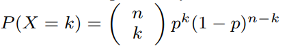
P – Probability of …
X – … specific success outcome occurring …
k – … this number of times …
p – … given this probability …
n – … and this sample size.
//// ???? ////
nC2 =
n = Total Number of Scores
2 = Desired successes.
//// ???? ////
Binomial Specific Rules
mean: µ = np
std dev: ![]()
Approximating Binomials
n – number of samples???
p – probability
q – probability of failure.
We can treat binomials as normal distributions as long as the following conditions are met: ????
- np ≥ 10
- nq ≥ 10 (recall q = 1 − p)
In other words,
Correlation
Kendall’s Tau – ???
Spearman’s rho – ???
Extrapolation: Predictions beyond the final x-value. The risk is that it may make crazy predictions, for example based on growth data between 12 – 18, a person may be expected to be 9 feet tall at 30.
A data point is considered to have high leverage and be influential if removing it dramatically changes the predictive model.
Sampling Proportions
Confidence Intervals
Sampling distribution has a normal model regarding standard errors.
68-95-99.7 rule applies:
68% within one standard error
95% within two standard errors
99.7% withing three standard errors.
This translates to mean that within two standard errors of p-hat, or the sample proportion, we find p, the population proportion, with 95% probability. This can also be called a 95% confidence interval.
This can also be written as the 95% confidence interval for p is p-hat ± 0.05.
A wider interval will mean greater probability that p, the population proportion, will fall within it.
Formula
The formula then is confidence interval = statistic ± margin of error.
Confidence Interval: Statistic ± Central Value * SE(statistic)
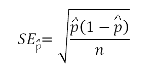
Margin of Error = Critical value Z * SEp-hat
SEp-hat = sqrt((p-hat(1 – p-hat))/n)
The key here is that Standard Error is contained within and not equivalent to margin of error. Margin of error is Critical Value Z * Standard Error
If we want the 95% interval we use:
Confidence Interval for Population Proportion = p-hat ± Critical Value Z * Standard Error
Where
p-hat: Population proportion.
Critical Value Z: This is basically how we take our desired confidence level into account. So if we wanted to be 95% confident then… … . The line that separates the accepted region of the normal distribution from the rejected region is the critical value.
Standard Error: SEp-hat = sqrt((p-hat(1 – p-hat))/n)
There are assumptions we need to check before using the above formula:
- The sample must be a Simple Random Sample
- The sample size cannot be more than 10% of the population size.
- The data is independent.
- Success/Failure Condition: np >= 10 and nq >= 10. If these are both greater than 10 normality can be assumed.
Common z-star critical value… values:
- 90%: z = 1.645
- 95%: z = 1.960
- 99%: z = 2.576
Table T in the back of text book, have a look later, gives a more conclusive list of values.
CI for finding the mean:
We cannot use z-star as the critical value and instead must use t-star. ???
ci = y-bar +- t-star * (s/sqrt(n))
Degrees of Freedom (df) = n – 1 # use this on t table to find t-star related to specific percentage.
Determining Sample Size for Proportion:
n = (z-star^2 * p-hat * q-hat) / (ME^2)
Basically what we do is we find the accuracy we need and then look up the associated z-star value to get the number, before plugging it in to the above equation.
If there is no value for p-hat we use p-hat = 0.5 as a default value as this will never give a sample size too small and will offer a conservative sample size.
Determining Sample Size for Means:
???
Sign Test
If we want to find an increasing trend or something???
p is always 0.5 to invoke a normal model.
Hypothesis Tests
Steps:
- State null hypothesis (H0) and alternative hypothesis (Ha)
- Assume null hypothesis is true and calculate test statistic.
- Determine a P-value: the probability of observing the data if null is true. This is a measure of the plausibility of the null hypothesis.
- Write conclusion is context.
Basically, the null hypothesis is no effect occuring. Essentially, is is the negative and disproves the hypothesis. The alternative hypothesis is the affirmative hypothesis. The alternative hypothesis may be two sided, so it may suggest a positive or negative correlation. It can just be one-sided as well, depending on how it is posed.
They aim to determine a P-value of a test statistic. It generally measures the plausability of the null hypothesis. Smaller P-values suggest the null hypothesis is less plausible. Generally, P = 0.5 is no difference because its 50/50. Generally, binomial or normal models are used.
In general the following holds true for P-values:
- >10% – insufficient evidence to support Ha
- 5-10% – slight evidence to support Ha
- 1-5% – moderate evidence to support Ha
- 0.1 – 1% – strong evidence to support Ha
- < 0.1% – very strong evidence to support Ha
A hypothesis should always be stated in population parameters ????
P0 is the assumed proportion from the null hypothesis.
Research Hyothesis – null hypothesis is against this claim.
Manufacturer’s Claim – null hypothesis is in favour of this claim.
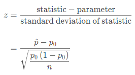
Test Statistic = (Statistic – Parameter)/SD(Stastic)
Significance Level: α = 0.07 # If the probability of getting the null hypothesis is less than the significance level, we reject it ???
https://usqstudydesk.usq.edu.au/m2/mod/equella/view.php?id=894466
Proportion Hypothesis Tests
The way to think of this is that we do not know the actual proportion but we can get a sample proportion and based on the normal model predict, within a certain confidence interval, the actual proportion.
Calculating Test Statistic:
Calculating P-Value:
P-value = P (z ≥ z) # What we are asking here is what is the probability of getting a z value greater or equal to the z value.
Another way to write this is:
P-value = P (z ≥ INSERT test statistic)
Basically you need to use a z-table. Can you just look at the equivalent negative value.
You then compare the p-value to the significance level, if ___ then ___ or if ___ then ___.
Use the z-table with the small red.
if it is two tail it needs to be doubled. ????
Basically, if the P-value is greater than alpha it means that the null hypothesis ought be rejected. Be careful of wording though.
Conditions:
- Random: Random sample or experiment.
- Normal: The sampling distribution needs at least 10 expected successes and 10 expected failures.
- Independence: sample size needs to be less than 10% and in general independence.
More on
μp^=p # This means that the average proportion of samples equals the proportion in general.
More on independence:
Nomenclature:
If we are trying to test whether a proportion has changed over time we can assign the old proportion to the null hypothesis, and the changed proportion to the alternate hypothesis. This is represented with the following nomenclature:
H0: p = 0.5
Ha: p ≠ 0.5 # because Ha can be less than or greater than 0.5, this is a two-tailed situation.
Ha: p > 0.5 # This is one tailed because Ha, the alternate hypothesis, is greater.
Mean Hypothesis Test
Calculating Test Statistic:
t = sample mean – predicted parameter mean / (sample standard deviation/sqrt(sample size))
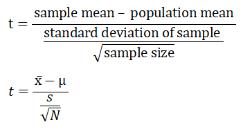
z-statistic vs. t-statistic:
Often with mean hypothesis tests we do not know the standard deviation and so we cannot use the z-statistic and must instead use the t-statistic. One of the main points of difference is that with Hypothesis tests we must estimate the standard deviation by using the standard deviation of the sample. Basically, this is an assumption.
Calculating P-Value:
P-value = ??? just grab it from t-table. The p-value is the area after the test statistic on the graph.
If p-value is lower than significance level rejected null. Else accept null.
Conditions:
- Random: Random sample or experiment.
- Normal: 1) n >= 30 (if a sample size is larger than this the central limit theorem can compensate for skew ???). 2) parent population normal. 3) Sample is symmetric and no significant outliers.
- Independence: sample size needs to be less than 10% and in general independence. n =< 10% of population
Nomenclature:
H0: µ = µ1
Ha: µ ≠ µ1
P-value:
If the critical value is the point between the accepted region and the rejected region, the P-value is the area of the rejected region.
If the p-value is lower than the alpha, the null is rejected.
If the p-value is greater than the alpha, the null is not rejected.
Type Errors
Type I Errors:
If the null hypothesis is true and rejected.
Probability of a type I error = significance level
Type II Errors:
If the null hypothesis is false and you fail to reject it.
Correct Conclusion:
Null hypothesis is true and accepted.
Null hypothesis is false and rejected.
Correlation vs Causation
Correlation does not imply causation.
As a general rule establishing causation is best done, perhaps only done, with an experiment. The problem with this is that in some cases we can create an experiment.
If you are going to try to argue for causation from correlation the following five things need to be looked at(RR truthful art, David S. Moore and George P. McCabe):
1) Strength of association
2) Association with other alternative explanatory variables
3) Multiple observational studies, multiple data sets
4) Explanatory variable procedes response
5) Cause makes logical sense of some kind.
Powers
????
Unsorted
If there were 4 cars with roughly equal distributions between four colours: blue, red, yellow and white the population proportion of white cars is p = 0.25.
p-hat = sample proportion. This varies from sample to sample, so this is the practical proportion. If you had 10 sets of 4 cars there might still be 0.25 of each colour, but in a set (called a sample) they might be all white in which case p-hat = 1.
sampling distribution:
Taking larger sample sizes tends to result in three things:
- The mean proportion remains roughly the same.
- Lower spread.
- Sample proportions become more like a Gaussian/normal model.
Sample proportions have a mean µ(p-hat) = p = 0.166. In other words, the mean of the sample proportions is the expected proportion.
Sample proportion standard deviation formula:
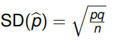
where p = population proportion
q = probability of failure???
n = sample size?
Statistics are numbers describing samples typically denoted with roman letters.
Parameters are numbers describing populations typically denoted with greek letters.
10% rule: if a sample is less than 10% of the population each of the results in the sample can be treated as independent.
Normal distribution: np >= 10 AND n(1-p)>=10. ???
Sampling Distribution: The distribution of proportions if allsamples. In other words, the distributions of multiple samples. The best way to think of this is that if you had four car colours: red, green, blue, orange. We cannot collect every single car out of the entire population to figure out the proportion of each car colour so we must rely on samples. Each sample will have its own distribution, but the distribution of the distribution of the sample is something we can use to estimate the overall population distribution.
Sampling Distributions are Gaussian in nature.
Sample Distribution Model: By comparing a sampling distribution to a specific sample set we can determine how much variance is likely to occur within a population.
Probability model choices:
For continuous, use normal/Gaussian
For binomial, use discrete.
The reason for this is that the Gaussian model requires a continuous series of values. Binomials have a success/failure condition so it is not possible to find a value between any two data values.
Binomial vs Poisson
Binomial distributions are used to model success/failure situations. For example, how many people in a set sample size would be considered overight according to the BMI. Some would ‘succeed’ in being classed as overweight, others would fail.
The binomial distribution counts discrete occurences among discrete trials.
Poisson distributions are used to model situations in which a specific event could happen a large number of times but actually happens rarely. An example would be number of wrongful criminal convictions.
The poisson distribution counts discrete occurences among a continuous domain.
Mean of the normal model is equal to the population mean.
Central Limit Theorum (CLT) – sample means have a normal model.
Confidence Intervals:
Symbols:
µ – population mean (parameter)
x̅ – mean of actual sample data. ??? this may be wrong, it may need to be y instead of x ?????? (statistic)
σ – population standard deviation (parameter)
s – standard deviation of actual sample data. (statistic)
σ^2 – ___ variance (parameter)
s^2 – ___ variance (statistic)
p – proportion of overall population (parameter)
p-hat – proportion of a sample (statistic)
r – correlation coefficient (statistic)
ρ – correlation coefficient (parameter)
R2 – correlation coefficient squared – (expressed as percentage from 0% – 100%)
Formulas
Average Formula:

Where y-bar (avg) = sum of y/divide number of y.
Standard Deviation Formula:
s = standard deviation (sometimes uses lower case sigma)
Σ = sum (called sigma, upper case)
y = data point
y-bar = average of data point
n = number of samples (-1 is added if only data for a sample of the population is provided)
Standard Deviation for Sample Proportion Formula:
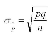
σ p-hat = Sample stand deviation
p = probability ???
q = probability of failure (basically 1-p) ???
n = sample size
Standard Error for Sample Proportion Formula:
Standard error = basically predicts the typical error between samples, can be used to estimate paremeter.
p-hat = sample population proportion
n = number of samples
Used to calculate confidence intervals ???? https://www.khanacademy.org/math/statistics-probability/confidence-intervals-one-sample/introduction-to-confidence-intervals/v/confidence-intervals-and-margin-of-error
z-Score Calculation

z – z- score is the number of std deviations from the mean of a specific variable.
µ – mean
σ – Standard Deviation
y – the observation
The process of converting to a z-score is called standardizing.
A positive z-score means data point is above average.
A negative z-score means data point is below average.
A z-score close to 0 means data point is close to average.
A z-score above 3 or below -3 suggests a data point is very unusual.
Unstandardising Formula
y = zσ + µ
y –
z –
σ –
µ –
Regression Line General Formula
![]()
y-hat –
b0 – intercept – the value of y when x is 0, so the point at which the function intercepts of the y-axis.
b1 – slope – rise over run
x – ????
??? Look at how to do this in SPSS ???
Residual Formula
![]()
e – Residual – How much the prediction misses the actual observation by.
y – Observation – Actual functional observation.
y-hat – Prediction – the prediction, typically provided by regression analysis.
Binomial Formula
P – Probability of …
X – … specific outcome occurring …
k – … this number of times …
p – … given this probability …
n – … and this sample size.
Glossary of Terms
Population: An overall group.
Sample: A subset of a population.
Statistics: numbers describing samples. Denoted by Roman letters.
Parameter: numbers describing populations. Denoted by Greek letters.
Categorical or Qualitative Variable – Answers questions about how cases fall into categories – Example: student id (categorical, categorizes a student). Categorical variables are used to define something, to sort it. In other words: what sort of quality does it have.
Quantitative Variable – Answers questions about quantity of what is measured – Example: course cost (numerical, calculates cost of course). The key to identifying quantitative variables is that they have some type of unit of measure, such as count or metres. In other words: what sort of quantity does it have.
Ordinal Variable – numerical order, but unnatural units (might still be categorical of quantative, depending). The difference between units is not precisely scalar, so on a ratings scale of 1 to 5 the difference between 5 and 3 might not be precisely two as there is a strange quality to it. Example: Movie Ratings.
Identifier Variables – These are used to identify a piece of data, think a student number. Serves a similar function to a unique or foreign key in database theory.
Continuous Variable – A variable that might have any possible number in it.
Note: there can be a subjective and tricky aspect to this in which something like Screen Size might be measured in inches and thus be qualitative or it might be a category like large. That category itself might also be quite subjective, so it is tricky.
Explanatory Variable (Independant) – Explains or influences changes in the response variable. For instance, Mass Body Index.
Response Variable (Dependant) – Measures the outcome, for instance a health outcome.
Extraneous Variable – Extra variables that may or may not impact experiment results.
Confounding Variable – An extraneous variable that will impact experiment results.
Variables of interest -Item or quantities the study is trying to measure.
Simpson’s Paradox – The average across multiple variables can be heavily distorted, its better to compare within the same variable.
Distribution – The distribution of the variable gives1) the possible values of the variable2) the realtive frequency of each value of the variable.
Marginal Distribution – the frequency distribution of a single variable, IE:
Independence – ???
Census – Attempts to take a sample of the entire population
Population – All objects or subjects of interest in a study.
Sample – Part of the population that intended to represent the whole.
Strata – ???
Kendall’s Tau – ???
Spearman’s rho – ???
Parameter – A number that summarizes data for an entire population.
Data Visualization
Five Rules of Data Visualization
Truthful – It is based on honest research.
Functional – Basically, its useful. People can do stuff with it.
Beautiful – It is aesthetically pleasing.
Insightful – it reveals something that would be difficult to otherwise see.
Enlightening – It changes our mind for a better result.
Quick Notes
“A visualization designer should never rely on a single statistic or a single chart or map”
ANOVA – analysis of variance. Variance is basically how much variation away from the mean there is. Maybe insert variance formula????
Standard deviation = Square root of the variance
Scientific Terms
Conjecture – Essentially a testable argument, based on intuition and logic.
Hypothesis – a conjecture that is formalized to be empirically tested.
Theory – Once a test has given some evidence of a conjecutre it is a theory???
Exploratory Data Analysis
Looking at central tendencies is often a good way to get insights:
Mode – the value that appears most.
Median – value that divides total values into two halves. If there are 9 values, the median will be the value with 4 lesser and 4 greater than it. If there are 8 values, the median will be the value in between 4 and 5.
Mean – sum of all values/total count of values
The advantage of the median is that it is a resistant statistic that will not change despite outliers.
Total Mean vs Grand Mean vs Weighted Mean.
////Make sure to include formula for weighted mean.
Seasonality – Consistent periodic fluctuations.
Trend – Is the data generally going up, down, staying the same, etc.
Noise – Random change basically.
Adjusted variation = Raw data chart – (seasonal data chart + noise data chart)
Log2 – each increment along the x axis represents a 2x increase.
Log10 – each increment along the x axis represents a 10x increase.
Horizon Charts
Red is the negative, blue is the positive.
Locally Weighted Scatter Plot Smoothing(LOWESS):
This is a process that is available in most software suites for situations in which there are local linear regressions between segments of a data set, but an overall linear regression is not appropriate and so needs to be smoothed between then???
Scatter Plot Matrix:
You can use a heat map of colour codes to make it look cool.
Parallel Coordinates Plot:
Can be used to show correlations between any types of data.
World Maps
Mapping data to a map can be a bit more difficult as the choice of map can be tricky. Most world maps are distorted as the globe is spherical-ish in nature and thus does not convert well to a flat 2d map. As such this conversion process distorts the map.
In the conversion, or ‘projection’, of this map from 3d to 2d it is disorted more the further it deviates from ‘standard lines’ which are lines along the map that have preserved ratios.
There are two main types of map projection methods:
Conformal Projections: Conformal projections are maps that preserve the general shapes of objects, like continents.
Equal Area Projections: This approach preserves the areas of things, for example the area of the landmass relative to the earth size, but this process may distort the maps appearance.
There are also techniques for preparing data
Proportional Symbol Map:
Choropleth Maps: Encodes information by assining shades of colors to regions. Darker or lighter shades, different colors, etc can be define different types of things. Red for loss, black for profit, etc.
Quantiles: percentiles based classes.
Fisher-Jenks Algorithm: Tries to find optimical natural breaks for grouping classes.
Useful Websites and Software
http://newsurveyshows.com/ – Some simple calculation tools for confidence intervals.
https://earthobservatory.nasa.gov/blogs/elegantfigures/2013/08/05/subtleties-of-color-part-1-of-6/ – NASAs color coding guide.
https://excelcharts.com/ – Amazing examples of charts that push the limits of excel.
https://datavizcatalogue.com/ – for examples of visualization techniques.
http://openrefine.org/ – for working with messy data.
http://www.chartjs.org/ – for graphing on websites
https://plot.ly/ – for graphing on websites
https://www.tableau.com/ – for graphing on websites
Versamap – old, free tool for creating maps of earth.